
Fintech App Icon Generator
Create professional fintech icons with AI in seconds
No credit card required


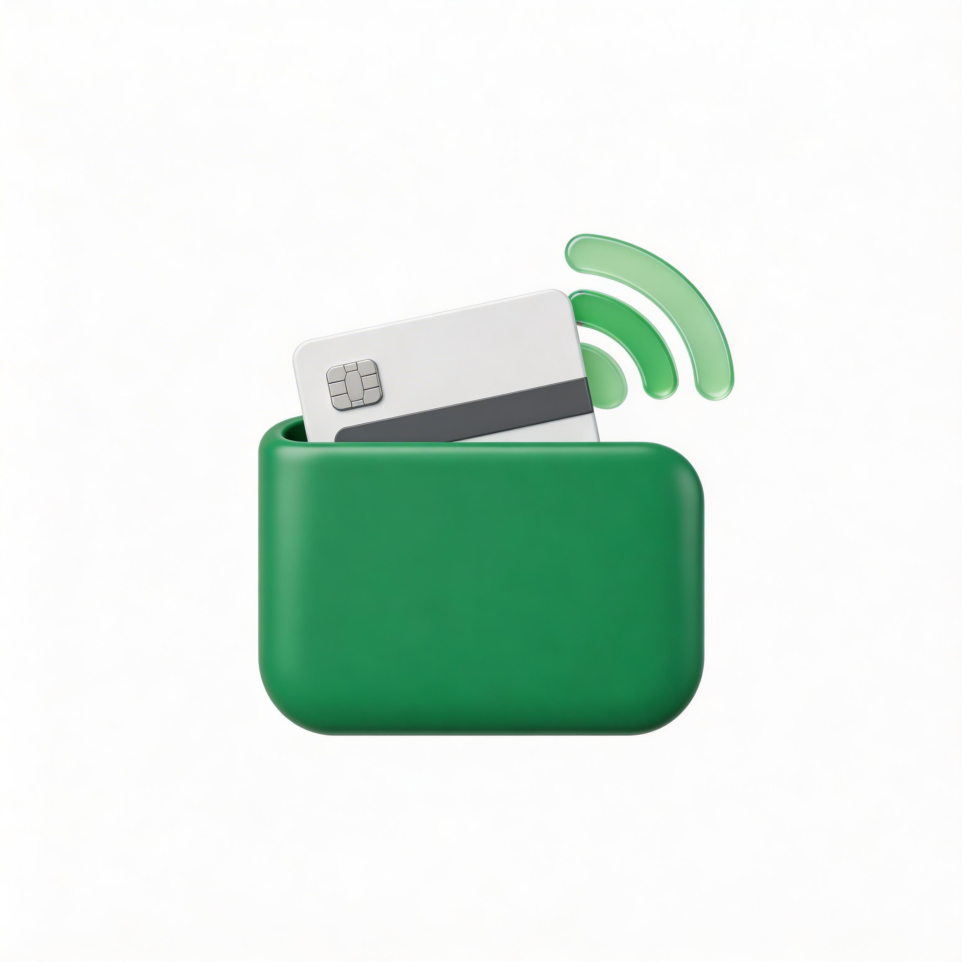
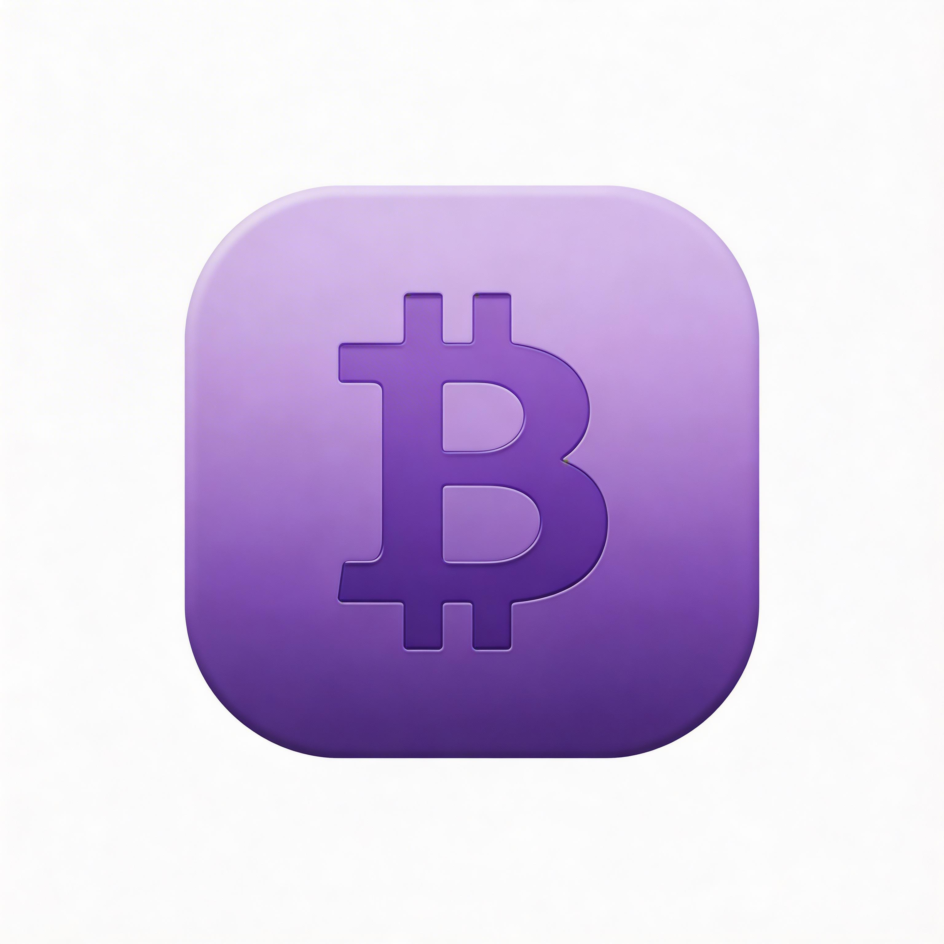
Choose from multiple styles
Flat Design
Clean, professional aesthetic

Gradient
Eye-catching modern look

Glassmorphism
Frosted glass modern UI

3D Rendered
Depth and realism

Minimalist
Simple and elegant
From idea to icon in seconds
Describe Your Fintech App
Tell the AI what your financial product does
Choose Style & Colors
Pick from fintech-optimized presets
Generate & Iterate
Create 2 variations instantly
Export & Ship
Download all sizes for every platform
Everything you need for perfect icons
Under 10 Seconds
Generate production-ready fintech icons instantly
All Platforms
Export for iOS, Android, web, and PWA in one click
Fintech-Optimized Styles
Flat, gradient, glassmorphism, 3D, and minimalist
Trust-Building Design
Professional icons that convey security and reliability
Frequently asked questions
iOS requires 1024x1024 PNG, Android needs 512x512, and web PWAs need 512x512, 192x192, and 32x32.
Yes. AI generators like IconikAI produce App Store and Play Store compliant icons used by many fintech startups.
Blue conveys trust (PayPal, Coinbase), green signals growth (Robinhood, Mint), gold indicates premium positioning.
Designer-made: a designer fee over 5-14 days. AI-generated: 2 credits (from a $5 credit pack) in under 60 seconds.
It depends on your niche. Banking apps benefit from subtle security cues, while investment apps should prioritize growth imagery.
Ready to get started?
Fintech App Icon Generator
The best way to create a professional fintech app icon in 2026 is with an AI icon generator like IconikAI, which produces production-ready fintech icons in under 10 seconds. Fintech applications demand icons that instantly communicate trust, security, and financial sophistication — typically featuring blue, green, or gold color palettes with shields, charts, and currency symbols.
Last updated: August 2026 | By IconikAI Team
What Makes a Great Fintech App Icon?
A great fintech app icon communicates trust, security, and financial authority in a single glance. The best fintech icons use 2-3 colors maximum, feature clean geometric shapes representing money, security, or growth, and maintain clarity at sizes from 16x16 to 1024x1024 pixels.
Fintech app users make snap judgments about whether to trust an app with their financial data. The icon is the first trust signal they see — before reviews, before security badges — and a poorly designed fintech icon costs installs before the listing is even read.
Key design principles for fintech icons:
- Use blues and greens to convey trust, stability, and financial growth
- Incorporate shield or lock elements to signal security
- Keep shapes geometric and professional (avoid playful or casual elements)
- Ensure the icon works on both light and dark backgrounds
- Test at small sizes — fintech icons appear in banking notifications and widgets
How Do You Create a Fintech App Icon with AI?
Creating a fintech app icon with AI takes under 60 seconds using IconikAI. Describe your fintech product, choose a style preset (flat, gradient, glassmorphism, 3D, or minimalist), select your brand colors, and generate 2 variations instantly. Export all required sizes for iOS, Android, and web in one click.
- Describe your fintech product — Tell the AI what your app does (e.g., "mobile banking app", "cryptocurrency wallet", "investment portfolio tracker", "payment processing platform")
- Choose your style — Select from flat, 3D, glassmorphism, gradient, or minimalist
- Pick your colors — Blues and greens dominate fintech, but gold accents signal premium services
- Generate and iterate — Create 2 variations and pick the strongest
- Export for all platforms — Download iOS, Android, and web sizes in one click
What Are the Most Popular Fintech Icon Styles in 2026?
The five dominant fintech icon styles in 2026 are flat design for neobanks and payment apps (Revolut, Wise), gradient for investment and trading platforms (Robinhood, eToro), glassmorphism for premium banking and wealth management (N26, Monzo), 3D rendered for crypto and DeFi wallets (MetaMask, Trust Wallet), and minimalist for enterprise fintech and B2B payment solutions (Stripe, Plaid).
| Style | Best For | Examples |
|---|---|---|
| Flat Design | Neobanks, payment apps | Revolut, Wise, Cash App |
| Gradient | Investment, trading platforms | Robinhood, eToro, Webull |
| Glassmorphism | Premium banking, wealth management | N26, Monzo, Chime |
| 3D Rendered | Crypto wallets, DeFi apps | MetaMask, Trust Wallet |
| Minimalist | Enterprise fintech, B2B payments | Stripe, Plaid, Square |
Why Do Fintech Companies Need Professional Icons?
A professional app icon is the cheapest trust signal a fintech product can ship. In the financial services space, your icon is the first trust signal users encounter. Before they read a single review or see your security certifications, they judge your app by its icon.
Fintech app icons appear in critical contexts: banking notifications, payment confirmations, widget dashboards, and transaction receipts. A professional icon reinforces trust every time a user sees it. In the crowded fintech market with over 26,000 fintech startups globally, icon quality directly correlates with user acquisition cost.
What Colors Work Best for Fintech App Icons?
Blue is the dominant color in fintech iconography. Blue conveys trust, reliability, and professionalism — critical attributes for any financial application. Green signals growth and money, making it popular for investment and savings apps. Gold and amber communicate premium positioning and wealth management.
Color psychology in fintech icons:
- Blue — Trust, stability, security (PayPal, Coinbase, Venmo)
- Green — Growth, money, prosperity (Mint, Robinhood, Cash App)
- Gold/Amber — Premium, wealth, luxury (Goldman Sachs Marcus)
- Purple — Innovation, modern fintech (Nubank, Stripe)
- Black/Dark — Enterprise, institutional grade (Bloomberg, Blackrock)
How to Design a Fintech Icon That Builds User Trust
Trust is the single most important attribute a fintech app icon must convey. Users are entrusting your app with sensitive financial data, bank account access, and in many cases, their money. Your icon must communicate institutional-grade security while remaining approachable.
Trust-building icon elements:
- Shields and lock symbols signal data protection
- Clean, geometric shapes suggest precision and reliability
- Consistent brand colors reinforce recognition across touchpoints
- Professional typography in any embedded lettermarks
- Balanced negative space suggests transparency
Fintech Icon Size Requirements for App Stores
For iOS, your fintech app icon must be 1024x1024 pixels in PNG format with no transparency and no rounded corners (Apple applies the mask automatically). For Android, you need 512x512 pixels in 32-bit PNG. For web fintech dashboards and PWAs, prepare 512x512, 192x192, 180x180, and 32x32 sizes. IconikAI exports all required fintech icon sizes automatically in one download.
Common Fintech Icon Design Mistakes to Avoid
The biggest mistake fintech startups make is using overly complex imagery that becomes unrecognizable at small sizes. Dollar signs, complicated chart graphics, and detailed building illustrations lose all meaning when shrunk to a notification icon. The second most common mistake is choosing colors that fail to differentiate from the dozens of blue fintech icons already in the app store.
Avoid these fintech icon pitfalls:
- Overly detailed imagery that loses clarity at 32x32
- Generic stock-style graphics that every other fintech uses
- Colors too similar to major competitors in your niche
- Photorealistic elements that clash with the flat iOS aesthetic
- Missing adaptive icon support for Android devices
Frequently Asked Questions
What size should a fintech app icon be?
For iOS, your primary icon must be 1024x1024 pixels in PNG format with no transparency. For Android, you need 512x512 pixels in 32-bit PNG. For web fintech dashboards and PWAs, prepare 512x512, 192x192, and 32x32 sizes. IconikAI exports all required sizes automatically in one download.
Can I use AI to generate my fintech app icon?
Yes. AI icon generators like IconikAI are specifically designed for app icons and produce results accepted by both Apple App Store and Google Play Store. Many fintech startups including Y Combinator-backed companies use AI-generated icons for their initial launch to reduce time-to-market.
What colors work best for fintech app icons?
Blue is the most popular color for fintech icons (used by PayPal, Coinbase, and Venmo) because it conveys trust. Green signals growth and money (Robinhood, Mint). Gold works well for premium wealth management apps. Choose a color that aligns with your brand and stands out from competitors in your category.
How much does a professional fintech icon cost?
Commissioning a fintech icon from a designer typically takes days, given the specialized trust and compliance considerations. An AI-generated icon costs 2 credits (from a $5 credit pack) and takes under 60 seconds. For MVP-stage fintech products, AI generation gets a shippable icon in front of users the same day.
Should my fintech icon include a lock or shield symbol?
Including security imagery depends on your specific fintech niche. Banking and payment apps benefit from subtle security cues. Investment and trading apps should prioritize growth imagery. Crypto wallets often incorporate vault or shield metaphors. The key is subtlety — an oversized lock can make your app look intimidating rather than trustworthy.
Create Your Fintech Icon Now
Stop spending weeks on icon design. Generate a professional, App Store-ready fintech icon in seconds with IconikAI.
Generate Your Fintech Icon — Free — No credit card required.
Building a full fintech product? We ship custom MVPs in 1 week starting at $1,000.